
In this thread, post your opinions about the digital graphics that have existed since the early 90s.
For example:
1) I miss the old lap counter when it counted down, not up (although that probably confused people).
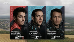
2) The graphics should either show just the surname of a driver (which was the case from 1994 to 2006) or their full name.
Take Nico Rosberg, for example - ROSBERG or Nico ROSBERG, not N Rosberg for some might not even know his full name.
3) When the driver graphic comes up, the FOM should also have a photo of the driver if his face is hidden behind the visor.
4) The tyre temperature graphic used in China 2007 should be shown more often.
5) An informative column showing the entire running order or just the top 10 should feature throughout the entire race unless it ruins the quality of the coverage.
6) The gap between two drivers in metres not seconds would be cool (it was used in the F1 Digital+ era).
The F1/FOM Graphic Design Thread
The F1/FOM Graphic Design Thread
Check out the position of the sun on 2 August at 20:08 in my garden
Allard Kalff in 1994 wrote:OH!! Schumacher in the wall! Right in front of us, Michael Schumacher is in the wall! He's hit the pitwall, he c... Ah, it's Jos Verstappen.
-
Alextrax52
- Posts: 2986
- Joined: 17 Apr 2013, 20:06
- Location: Bromborough near Liverpool
Re: The F1/FOM Graphic Design Thread
I used to miss the graphic in the early days of the knockout format where the driver tags (BUT ALO WEB etc) Went through the screen at the bottom. The graphics used at Indy in 2002 looked like a 2 year old had created them. I like the current names for drivers like M Webber and F Alonso just the surname on it's own felt too short
Re: The F1/FOM Graphic Design Thread
Kimi-ICE wrote:I used to miss the graphic in the early days of the knockout format where the driver tags (BUT ALO WEB etc) Went through the screen at the bottom. The graphics used at Indy in 2002 looked like a 2 year old had created them. I like the current names for drivers like M Webber and F Alonso just the surname on it's own felt too short
I've searched for fonts on Word which match the old graphics, but the FOM make their own and are private.
For the graphics between 1994 and 2003, the obvious choice would be Gill Sans MT in bold and for 2004-8, Lao UI, also in bold.
The graphics in Indy in 2002 were actually those used by F1 Digital+ (1997-2002) and the FOM for no apparent reason used them for that race alone.
Check out the position of the sun on 2 August at 20:08 in my garden
Allard Kalff in 1994 wrote:OH!! Schumacher in the wall! Right in front of us, Michael Schumacher is in the wall! He's hit the pitwall, he c... Ah, it's Jos Verstappen.
-
Alextrax52
- Posts: 2986
- Joined: 17 Apr 2013, 20:06
- Location: Bromborough near Liverpool
Re: The F1/FOM Graphic Design Thread
good_Ralf wrote:The graphics in Indy in 2002 were actually those used by F1 Digital+ (1997-2002) and the FOM for no apparent reason used them for that race alone.
It was so frustrating watching that race with those graphics having been used to the old ITV graphics which were good around that time. Then again i was only 5 years old at the time and can't remember what they look like
Re: The F1/FOM Graphic Design Thread
Kimi-ICE wrote:good_Ralf wrote:The graphics in Indy in 2002 were actually those used by F1 Digital+ (1997-2002) and the FOM for no apparent reason used them for that race alone.
It was so frustrating watching that race with those graphics having been used to the old ITV graphics which were good around that time. Then again i was only 5 years old at the time and can't remember what they look like
If you still can't remember what the graphics looked like, this race highlights video in the link below (with a groovy tune) should solve the majority of your potential problems.
http://www.youtube.com/watch?v=L2y-Ycltd8A
Check out the position of the sun on 2 August at 20:08 in my garden
Allard Kalff in 1994 wrote:OH!! Schumacher in the wall! Right in front of us, Michael Schumacher is in the wall! He's hit the pitwall, he c... Ah, it's Jos Verstappen.

Re: The F1/FOM Graphic Design Thread
I'm not sure using full names and driver photographs would be a good idea.
While I loved the 94-03 graphics, I prefer the newer ones. They look clean and perhaps most crucially they don't obstruct what's going on. The big bottom overlay dimmed the screen, had big blocky graphics and letters and could potentially obscure a few things on the camera.
My opinion of the thing is that the display should be something that is visually interesting but not overly present. The current overlay does a fantastic job of this by using a very small amount of space whilst scattered around the outer edges of the screen and only shows things when they're relevant.
By the way, the font used today is DIN, if you weren't aware!
Re: The F1/FOM Graphic Design Thread
DalekSam wrote:I'm not sure using full names and driver photographs would be a good idea.
In the early 90s (1992-3 I think), the graphics featured the full names of the drivers and a photo as well.
Talking of which, the car number should be featured in the graphics again eg. Jenson BUTTON - McLaren Mercedes - GBR - 5 and probably in a white font in a blue box in the bottom right hand corner of the driver graphic.
I liked it when from 1994 to 2003, the final finishing order would include the average speed of each driver, including the ones that had retired.
Check out the position of the sun on 2 August at 20:08 in my garden
Allard Kalff in 1994 wrote:OH!! Schumacher in the wall! Right in front of us, Michael Schumacher is in the wall! He's hit the pitwall, he c... Ah, it's Jos Verstappen.
-
go_Rubens

- Posts: 3415
- Joined: 25 Mar 2013, 21:12
- Location: A raging river somewhere in the Eastern (cough) United States (cough)
Re: The F1/FOM Graphic Design Thread
good_Ralf wrote:DalekSam wrote:I'm not sure using full names and driver photographs would be a good idea.
In the early 90s (1992-3 I think), the graphics featured the full names of the drivers and a photo as well.
Talking of which, the car number should be featured in the graphics again eg. Jenson BUTTON - McLaren Mercedes - GBR - 5 and probably in a white font in a blue box in the bottom right hand corner of the driver graphic.
I liked it when from 1994 to 2003, the final finishing order would include the average speed of each driver, including the ones that had retired.
I'd like to see an average lap time during the race, excluding laps where drivers pitted during the race. I'd think it would be cool.
A graphic where car telemetry is displayed during a period with an onboard camera would be neat (not just speed, tachometer, and mish mash like that). For example, g-load on tyres, braking forces, traction, etc. I think would be neat. And finally, I didn't mind the 94-03 timing system that much, but maybe different colors and letters would be better.
Felipe Baby, Stay Cool
Albert Einstein wrote:Two things are infinite: the universe and human stupidity; and I'm not sure about the universe.
Re: The F1/FOM Graphic Design Thread
good_Ralf wrote:DalekSam wrote:I'm not sure using full names and driver photographs would be a good idea.
In the early 90s (1992-3 I think), the graphics featured the full names of the drivers and a photo as well.
Talking of which, the car number should be featured in the graphics again eg. Jenson BUTTON - McLaren Mercedes - GBR - 5 and probably in a white font in a blue box in the bottom right hand corner of the driver graphic.
I liked it when from 1994 to 2003, the final finishing order would include the average speed of each driver, including the ones that had retired.
With not classified drivers, the worst thing nowadays is that all those are just listed "not classified" but there's no info how many laps they completed (or basically were down to the winner)
So Grosjean should have been listed either with 15 laps down or 63 laps completed, Ricciardo with 17 laps down or 61 laps completed etc.
Re: The F1/FOM Graphic Design Thread
There is this new feature (I presume) which I have seen in free practice. It shows a driver's previous lap times from practice and also has the age of the tyres in laps.
Check out the position of the sun on 2 August at 20:08 in my garden
Allard Kalff in 1994 wrote:OH!! Schumacher in the wall! Right in front of us, Michael Schumacher is in the wall! He's hit the pitwall, he c... Ah, it's Jos Verstappen.
Re: The F1/FOM Graphic Design Thread
Checked on the Internet on F1 fonts
1994-2003 : Futura
2004-9: Frutiger 55
2010-: DIN (thank you DalekSam!)
I have installed Futura onto the computer but Frutiger isn't free, damn it.
1994-2003 : Futura
2004-9: Frutiger 55
2010-: DIN (thank you DalekSam!)
I have installed Futura onto the computer but Frutiger isn't free, damn it.
Check out the position of the sun on 2 August at 20:08 in my garden
Allard Kalff in 1994 wrote:OH!! Schumacher in the wall! Right in front of us, Michael Schumacher is in the wall! He's hit the pitwall, he c... Ah, it's Jos Verstappen.

Re: The F1/FOM Graphic Design Thread
This year the graphic design will change. Not to much happy to know it, I loved the graphic of the last 4 years. Anyway, I'm don't think will be a radical change
Re: The F1/FOM Graphic Design Thread
f1andrea wrote:This year the graphic design will change. Not to much happy to know it, I loved the graphic of the last 4 years
Where did you find out about that? What I would love to see FOM do is introduce a predictor in qualifying. In the F1 Digital+ era when a driver went through a timing beam, a computer would take their best sector times and guess roughly where they would end up. This video explains what used to happen.
If the graphics do change, then I hope they're also memorable. I loved the era with the cube-shaped boxes flipping over (2004-9).
Check out the position of the sun on 2 August at 20:08 in my garden
Allard Kalff in 1994 wrote:OH!! Schumacher in the wall! Right in front of us, Michael Schumacher is in the wall! He's hit the pitwall, he c... Ah, it's Jos Verstappen.
-
UncreativeUsername37
- Posts: 3420
- Joined: 25 May 2012, 14:36
- Location: Earth
Re: The F1/FOM Graphic Design Thread
good_Ralf wrote:If the graphics do change, then I hope they're also memorable. I loved the era with the cube-shaped boxes flipping over (2004-9).
What I really want is a return to yellow squares and blue ovals. It would make everything that happens feel like it was in that era.
Rob Dylan wrote:Mercedes paying homage to the other W12 chassis by breaking down 30 minutes in
Re: The F1/FOM Graphic Design Thread
The graphics have changed. The car number chosen by a specific driver no appears in the top-left hand corner and the N Surname has now become just Surname. Weird how there were no ERS/MGU graphics.
Check out the position of the sun on 2 August at 20:08 in my garden
Allard Kalff in 1994 wrote:OH!! Schumacher in the wall! Right in front of us, Michael Schumacher is in the wall! He's hit the pitwall, he c... Ah, it's Jos Verstappen.
-
dinizintheoven

- Posts: 3998
- Joined: 09 Dec 2010, 01:24
Re: The F1/FOM Graphic Design Thread
And don't forget they've picked a coloured stripe representing what team each driver is driving for.
Dark blue = Red Bull
Turquoise = Mercedes
Red = Ferrari (obviously)
Yellow (wasn't it?) = Toleman
Silver = McLaren
Orange = Force India
Dark grey = Sauber
Gold = Toro Rosso
White = Williams
Dark red = Marussia
Green = Caterham
It almost reminds me of the colour palette of the Commodore 64.
Dark blue = Red Bull
Turquoise = Mercedes
Red = Ferrari (obviously)
Yellow (wasn't it?) = Toleman
Silver = McLaren
Orange = Force India
Dark grey = Sauber
Gold = Toro Rosso
White = Williams
Dark red = Marussia
Green = Caterham
It almost reminds me of the colour palette of the Commodore 64.
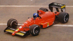
James Allen, on his favourite F1 engine of all time:
"...the Life W12, I can't describe the noise to you, but imagine filling your dustbin with nuts and bolts, and then throwing it down the stairs, it was something akin to that!"
"...the Life W12, I can't describe the noise to you, but imagine filling your dustbin with nuts and bolts, and then throwing it down the stairs, it was something akin to that!"
Re: The F1/FOM Graphic Design Thread
I must say I'm not too fond of the new graphics. The coloured stripes are very hard to see. If they would make it all a bit bigger it would already be so much better. And I don't understand the race numbers they show before the race, some of them are in the same font that is used on the cars, but some aren't... Anyway, I like that they added the numbers and went back to using just the surname. Now if only this
would happen.
UgncreativeUsergname wrote:good_Ralf wrote:If the graphics do change, then I hope they're also memorable. I loved the era with the cube-shaped boxes flipping over (2004-9).
What I really want is a return to yellow squares and blue ovals. It would make everything that happens feel like it was in that era.
would happen.
MOTOR RACING IS DANGEROUS
Re: The F1/FOM Graphic Design Thread
Waris wrote:I must say I'm not too fond of the new graphics. The coloured stripes are very hard to see. If they would make it all a bit bigger it would already be so much better. And I don't understand the race numbers they show before the race, some of them are in the same font that is used on the cars, but some aren't... Anyway, I like that they added the numbers and went back to using just the surname.
I agree with you.
I think also is very stupid that on f1.com live timing the sector times are now only a yellow/green/purple point...if you want see the sector times you must purchase the f1 app and have a smartphone with android or ios..so stupid!
Re: The F1/FOM Graphic Design Thread
Hm, it appears they have changed the coloured stripe for the Toro Rosso drivers from yellow to blue, probably in an attempt to make them not so similar to the Lotus ones, but now they really look like the Red Bull ones, so it's tit for tat...
MOTOR RACING IS DANGEROUS

Re: The F1/FOM Graphic Design Thread
Waris wrote:Hm, it appears they have changed the coloured stripe for the Toro Rosso drivers from yellow to blue, probably in an attempt to make them not so similar to the Lotus ones, but now they really look like the Red Bull ones, so it's tit for tat...
Well, it's probably more accurate that way, knowing ownership, translation of the team name, political affiliation, etc.....
watka wrote:I find it amusing that whilst you're one of the more openly Christian guys here, you are still first and foremost associated with an eye for the ladies!
MCard LOLAdinizintheoven wrote:GOOD CHRISTIANS do not go to jail. EVERYONE ON FORMULA ONE REJECTS should be in jail.
-
UncreativeUsername37
- Posts: 3420
- Joined: 25 May 2012, 14:36
- Location: Earth
Re: The F1/FOM Graphic Design Thread
I never confused the gold and the yellow, but the blue is just a bit too much like the purple... I'm sure I'll get used to it.
Rob Dylan wrote:Mercedes paying homage to the other W12 chassis by breaking down 30 minutes in